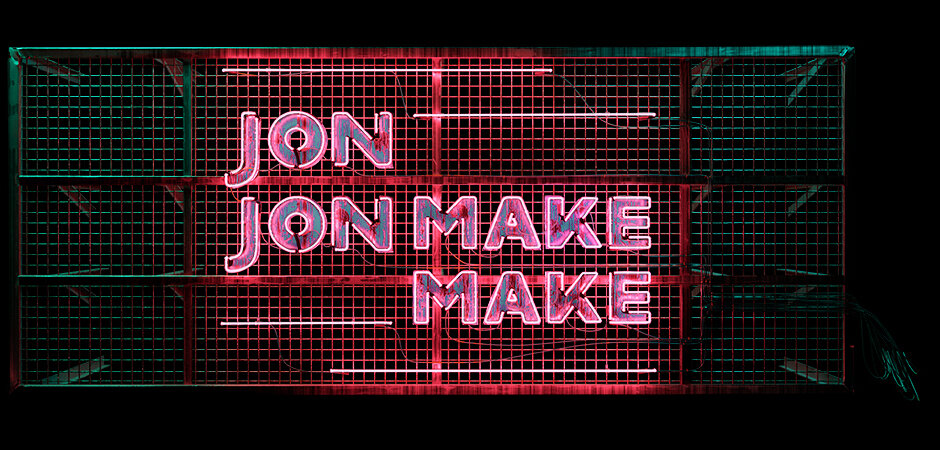
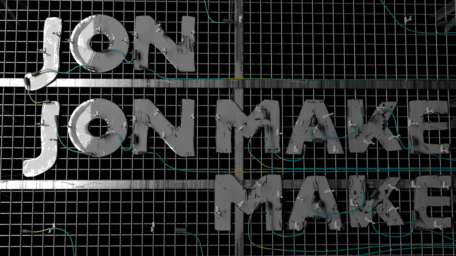
JonJOnMAKEMAKE NEON Ident
This project began as a 3D Logo for myself that quickly evolved into an Ident and then even further to a potential video game environment demo. I decided to pump the brakes on the bigger long term picture and just get the core idea done first, then I could return to the large concept once I got some other projects off my plate. I love detail and I've wanted to play around with some neon for quite some time.
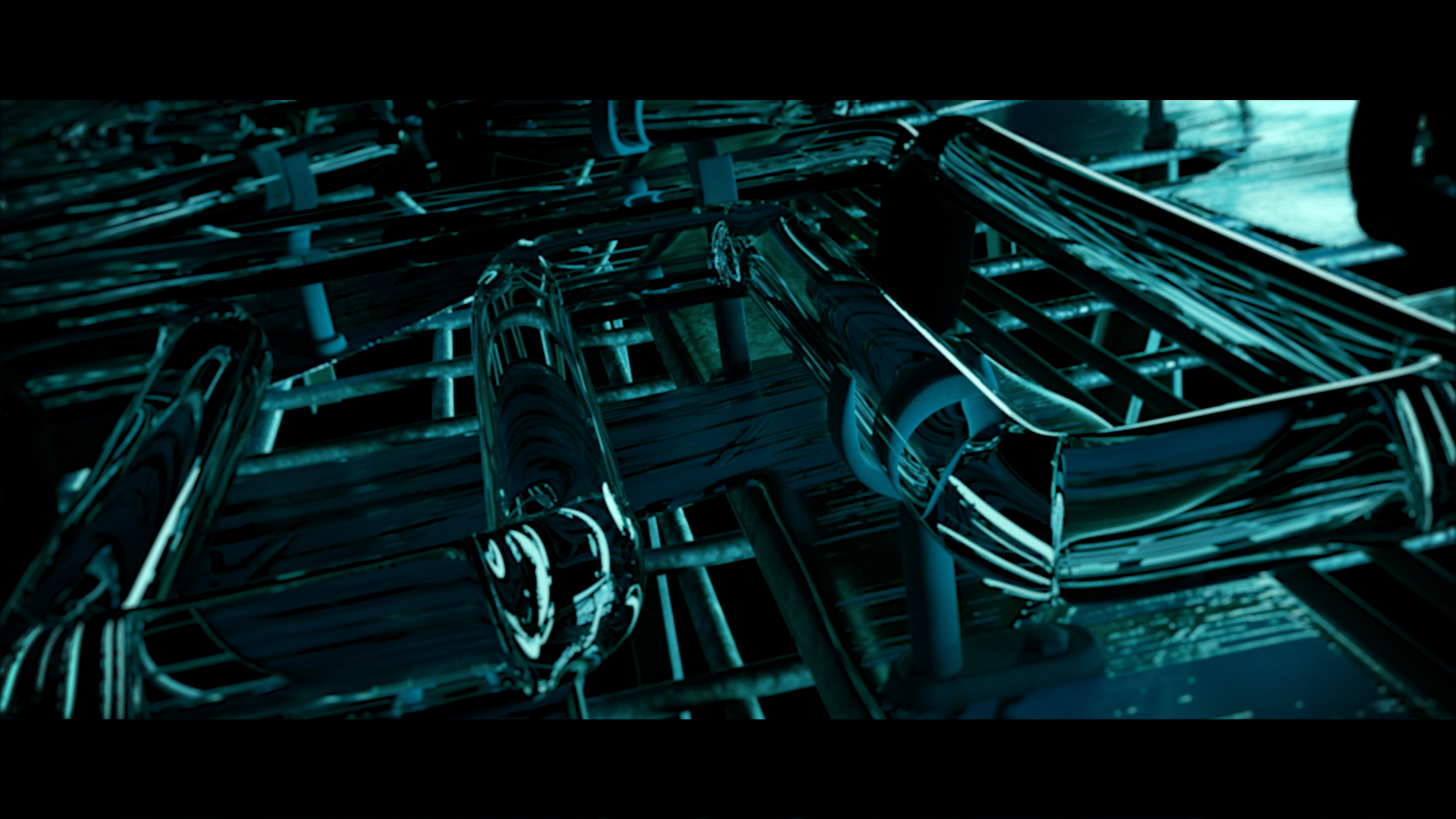
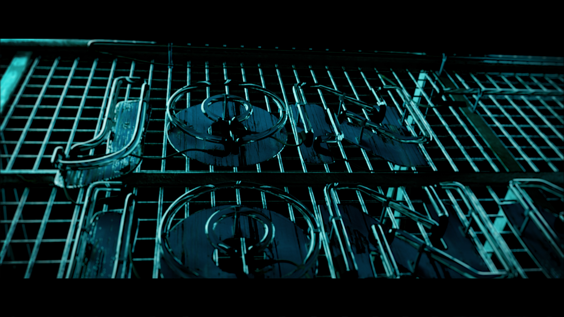
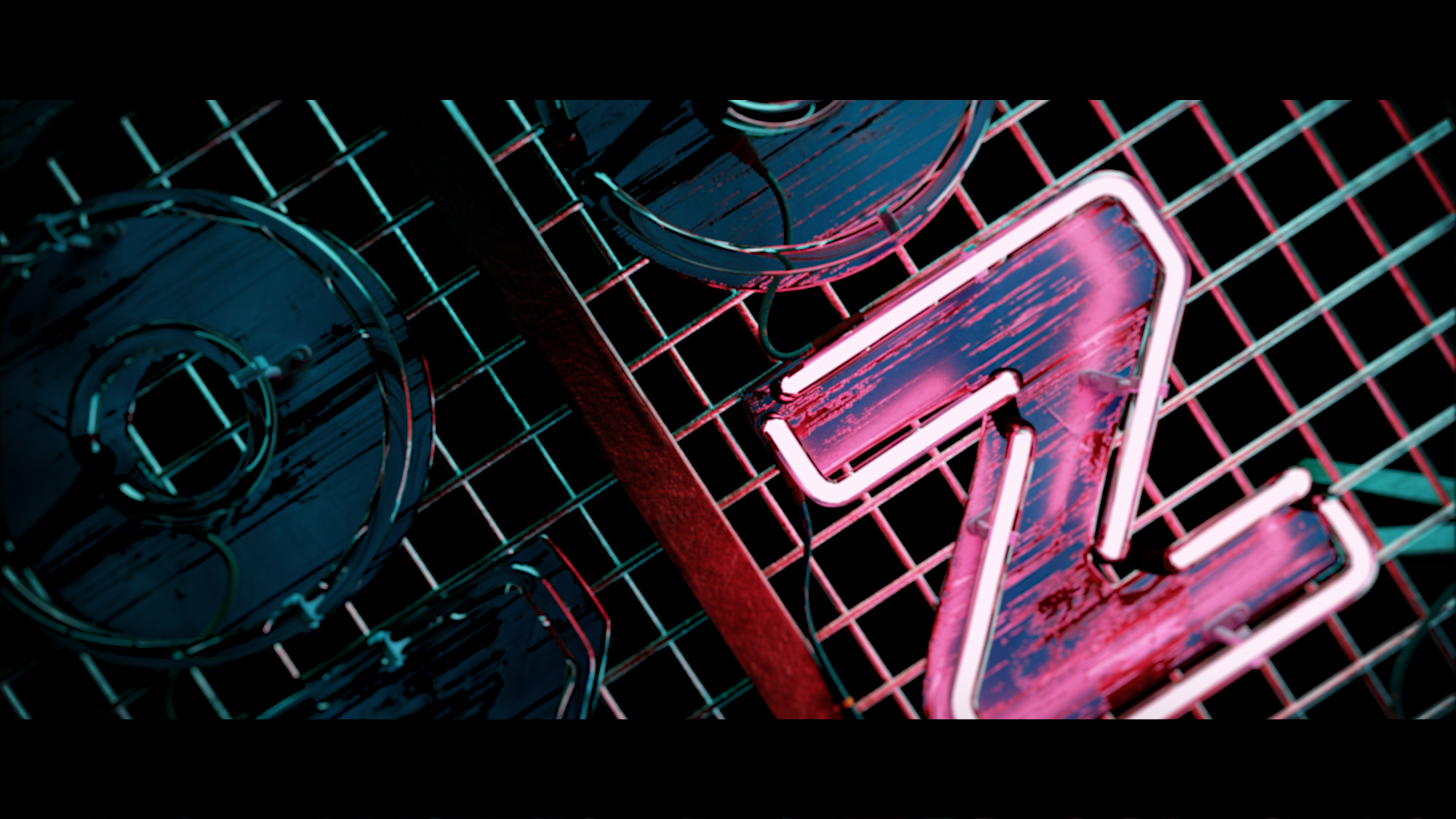
Everyone seems to copy Rizon Parein when they make CG neon and let's be honest it's kind of hard not too! He is really bloody good at it and his work is everywhere. I am of course influenced by his work however I really wanted to try and develop my own take on CG neon and really dove into see how much realism I could create. Once the design and texturing was done I started storyboarding the Ident in motion and wanted to create motion and atmosphere without bringing in any new elements. With this in mind I decided to create a camera fly through with unconventional camera moves and angles to both engage and intrigue the viewer. The track in the Ident is Fredrick Alonso's 96 (Tech Mix), it has a grungy tone to it that makes me think of sinister back alley dealings in some not-so-far-off red light district. This fit my neon perfectly, a raw track with a lot of punch for a neon sign that's seen better days but still shines bright surrounded by darkness. Also on revisiting this project I feel that David Fincher's opening title sequence for Fight Club was a subconscious inspiration.
There are stills and some process shots from the project if you scroll down as well and please hit like or share it otherwise the darkness creeps ever slowly closer...
Created with: Maya, Zbrush, Substance, Redshift, and Photoshop
